
Hot Pockets
Rebranding a household name.
Role: Senior Designer (with Jorge Arteaga)
Creative Direction: Fred Hart
Logo: Greg Lindy / Lux Typo
Created at Interact Brands
Creative Direction: Fred Hart
Logo: Greg Lindy / Lux Typo
Created at Interact Brands
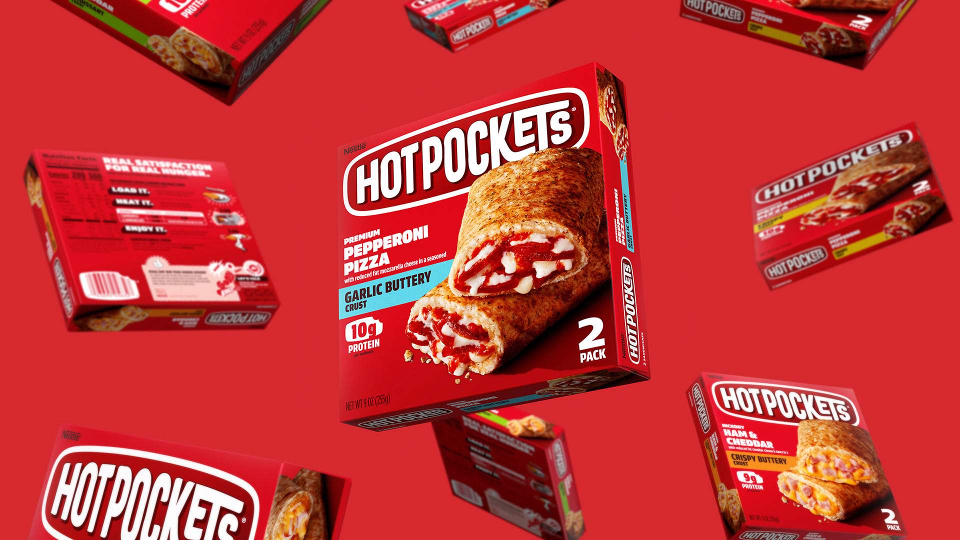
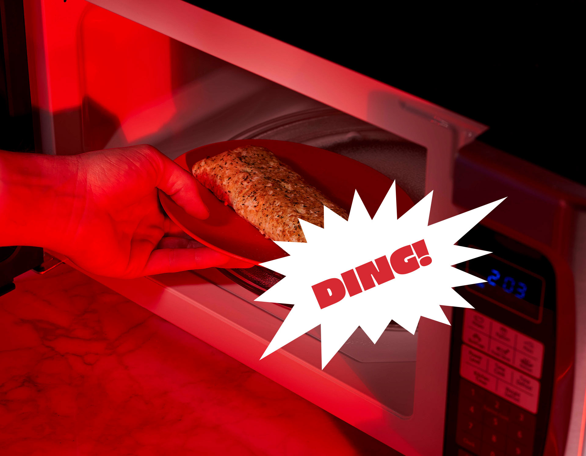
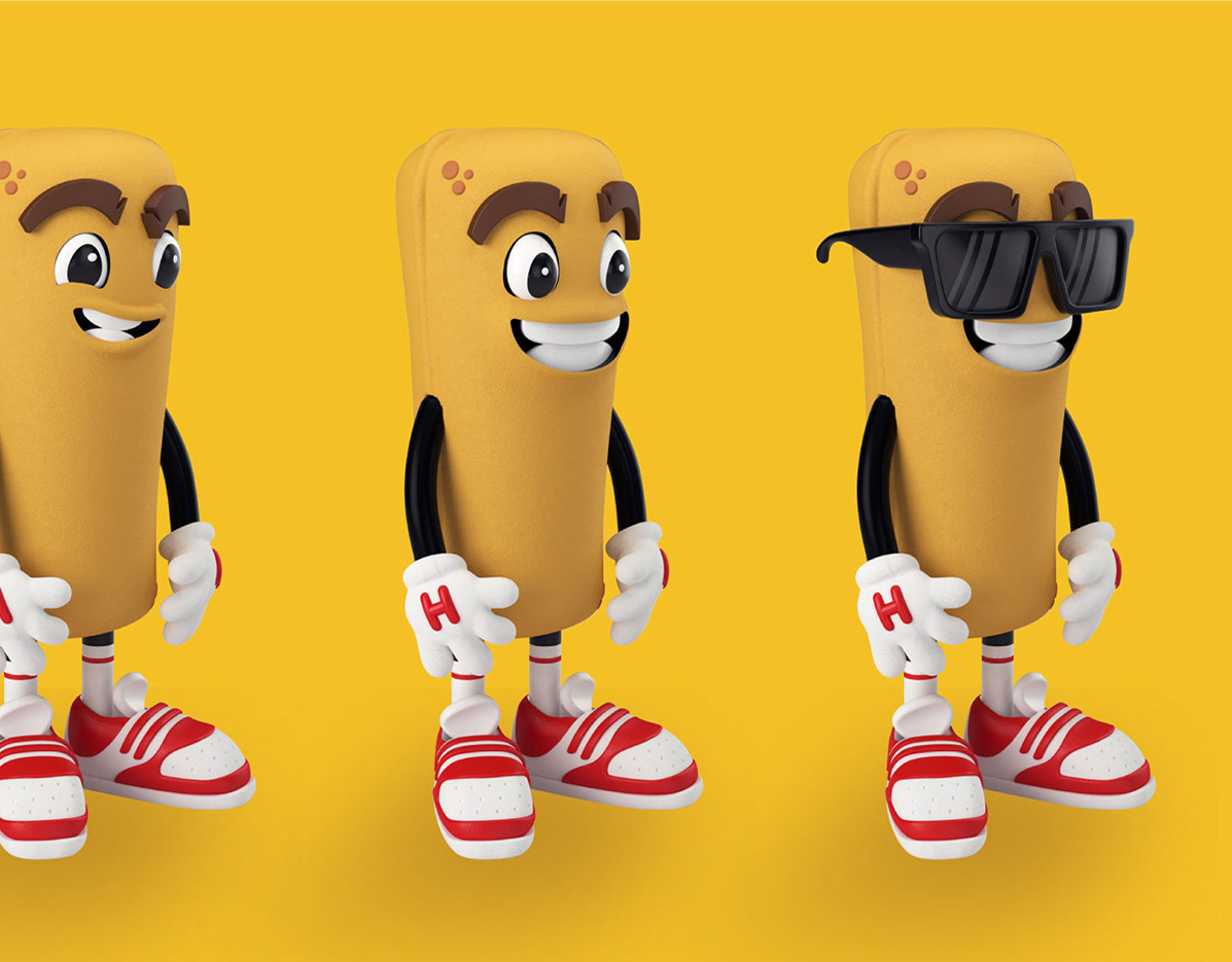
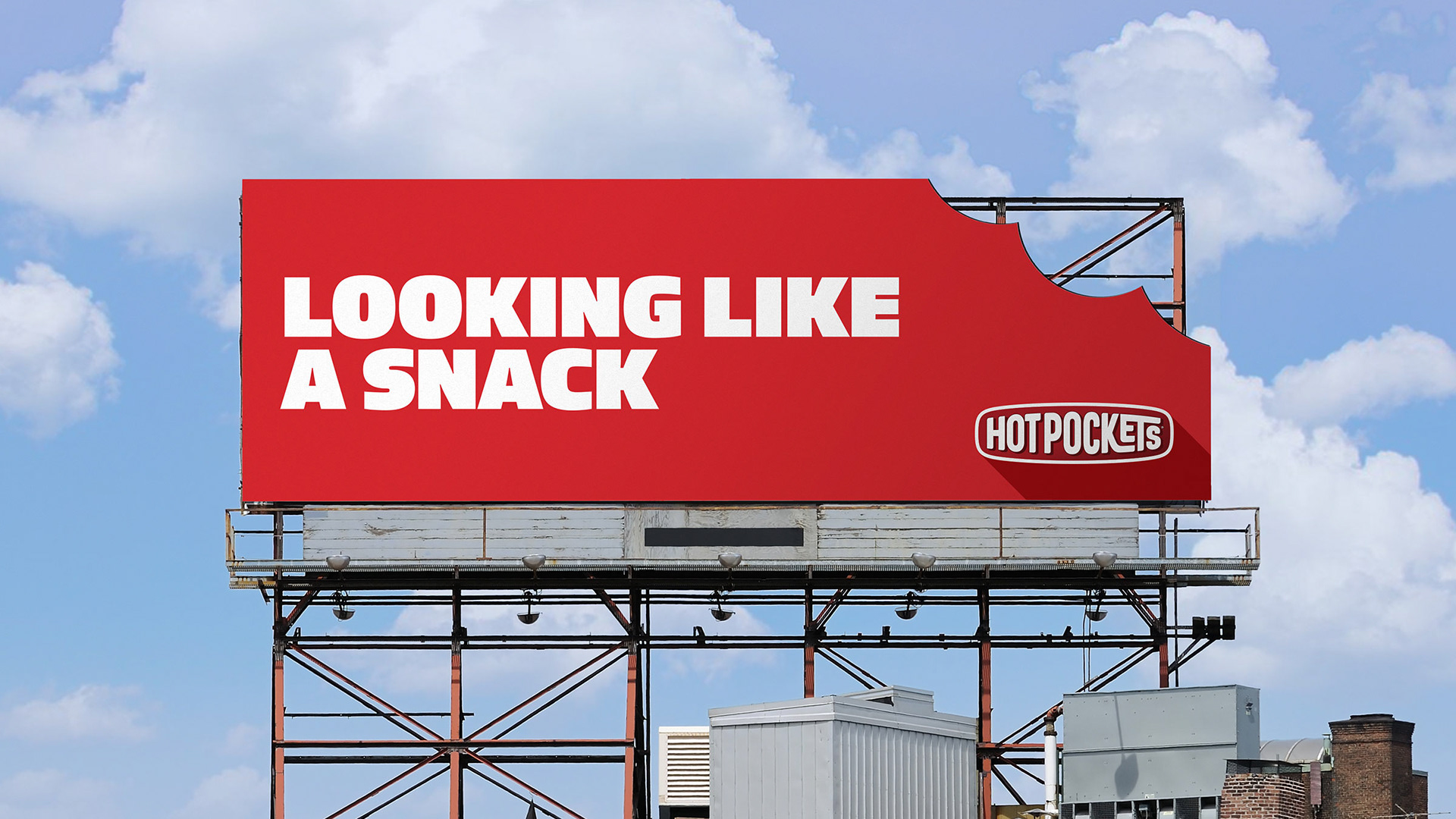
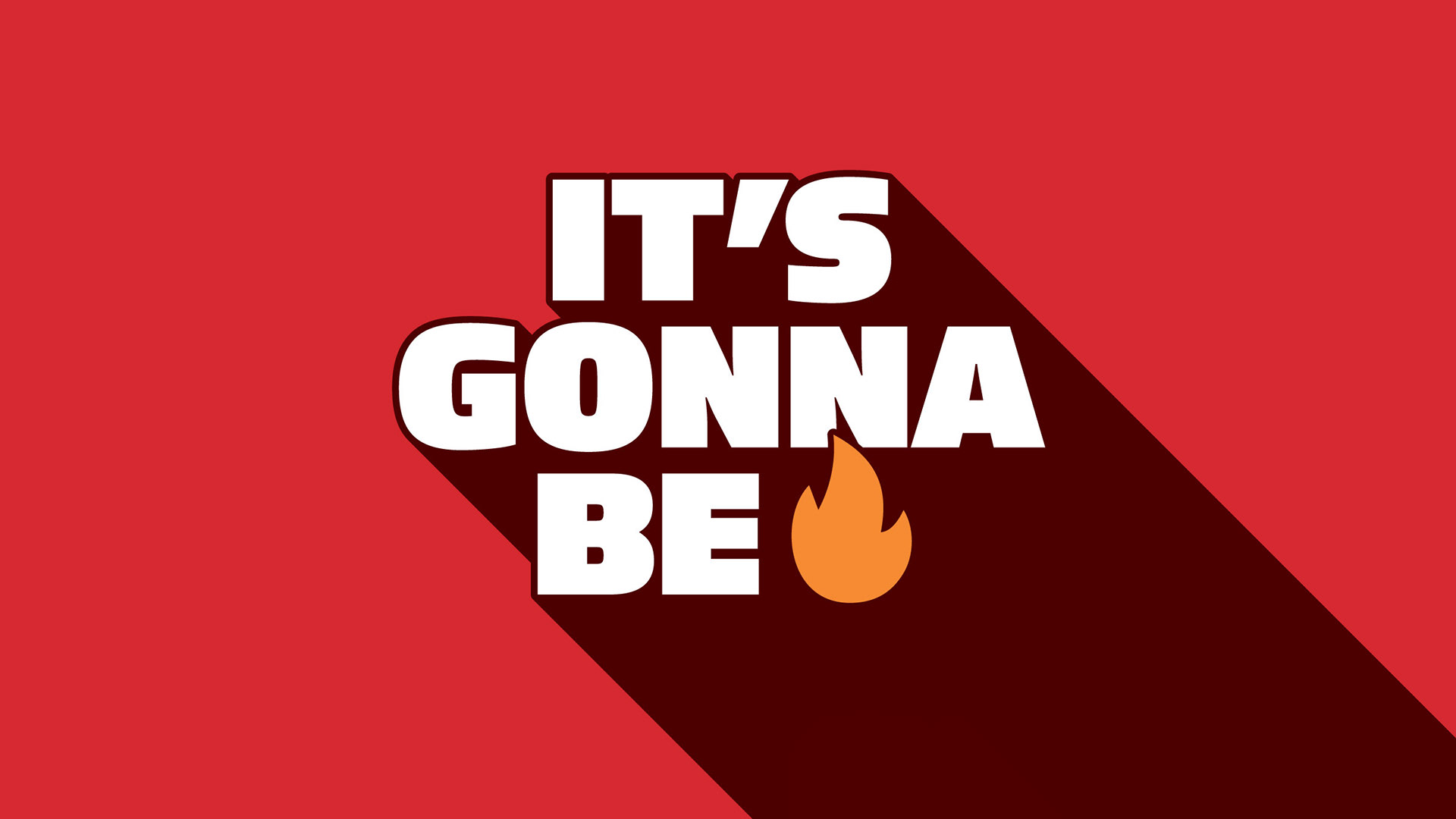
Playing with FIRE.
It's not everyday you get to work on a brand you grew up with. For decades, Hot Pockets have been a cultural force that nearly everyone's had personal experience with, so we knew we needed to craft an expression of the brand that connects in an authentic way.


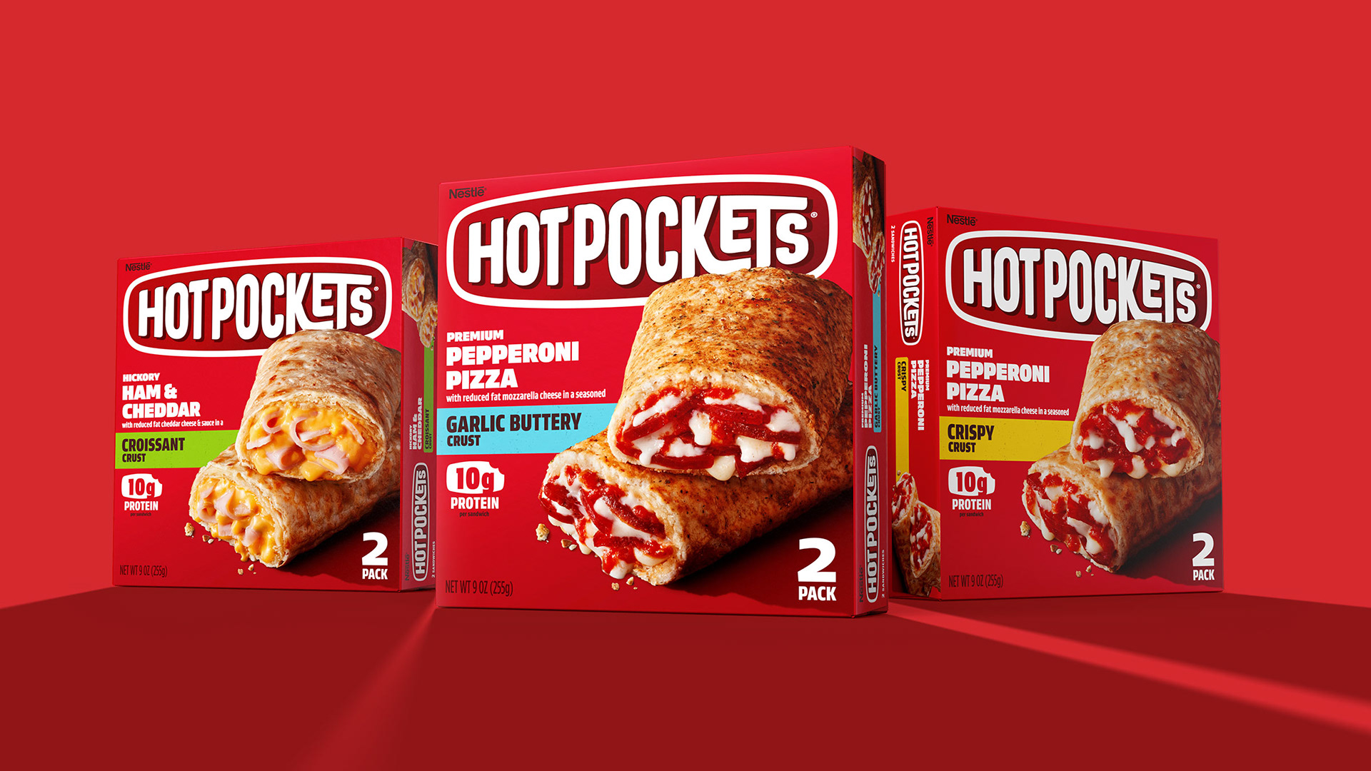


Charting a fresh new direction.
Our task was not only to find a vibrant new visual expression for the brand, but to find it's true tone of voice, which has become more energetic and reflects the interests and attitudes of our core eater.
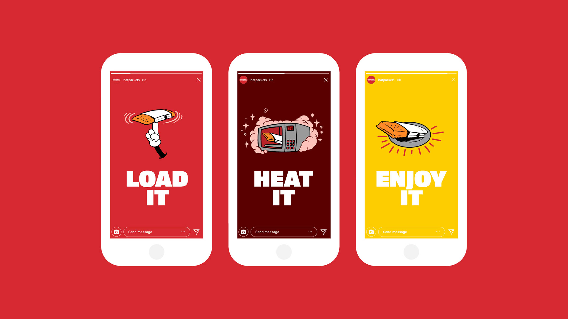
We created a juiced up brand communication standard that completely revolutionizes how the brand looks, talks, and expresses itself.

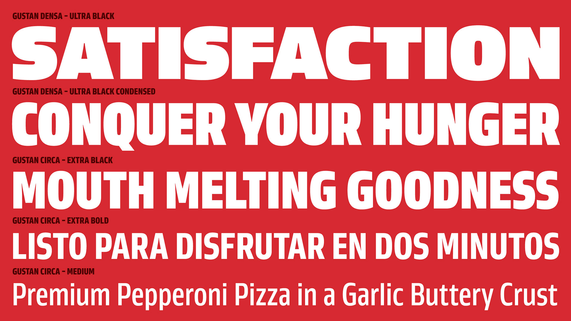

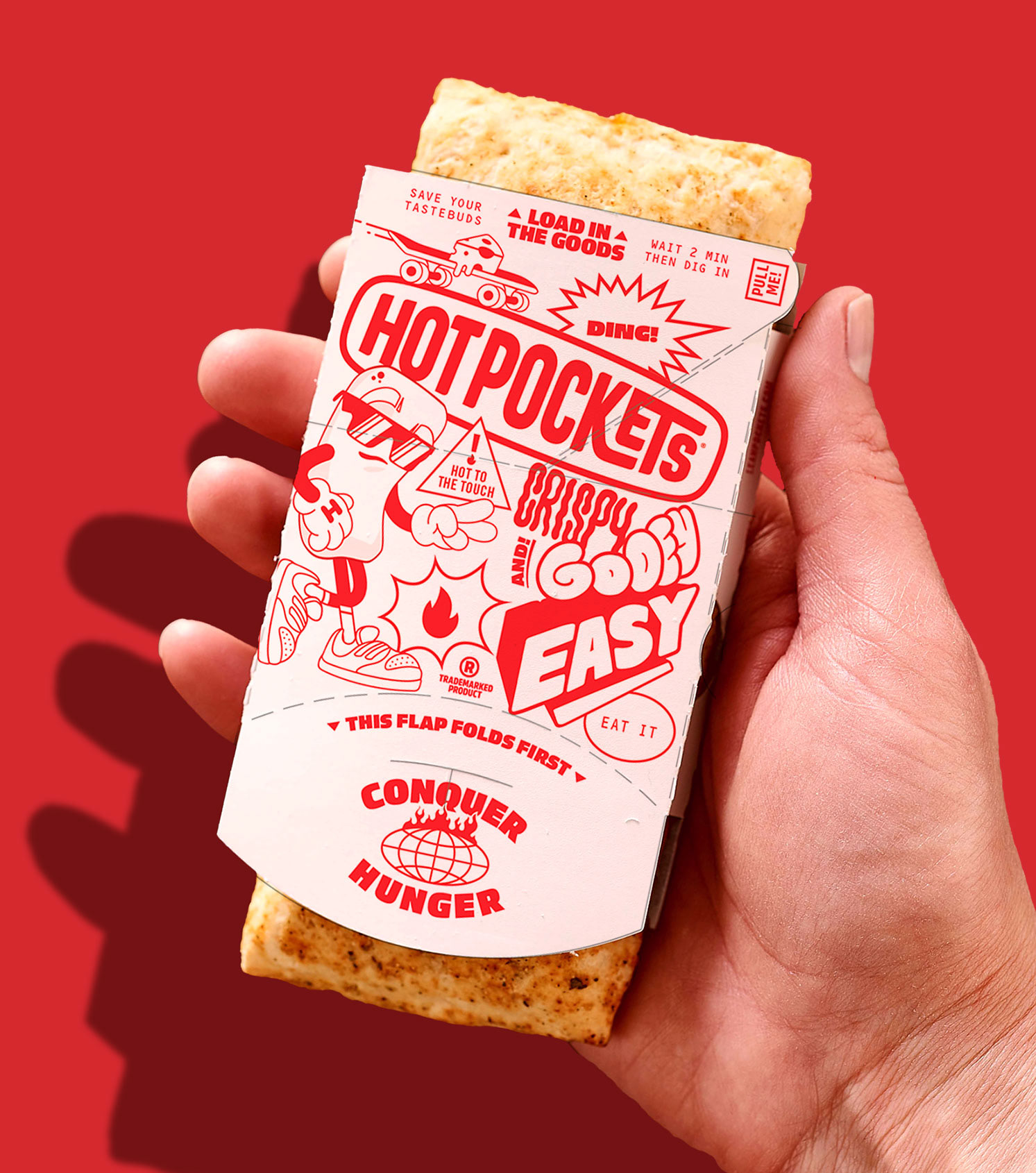
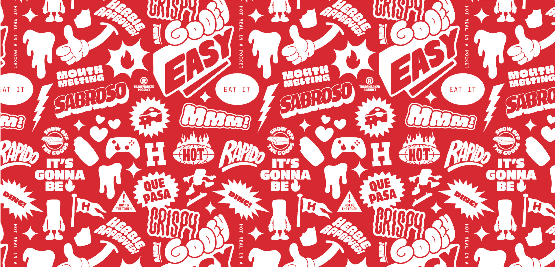
Building out the brand.
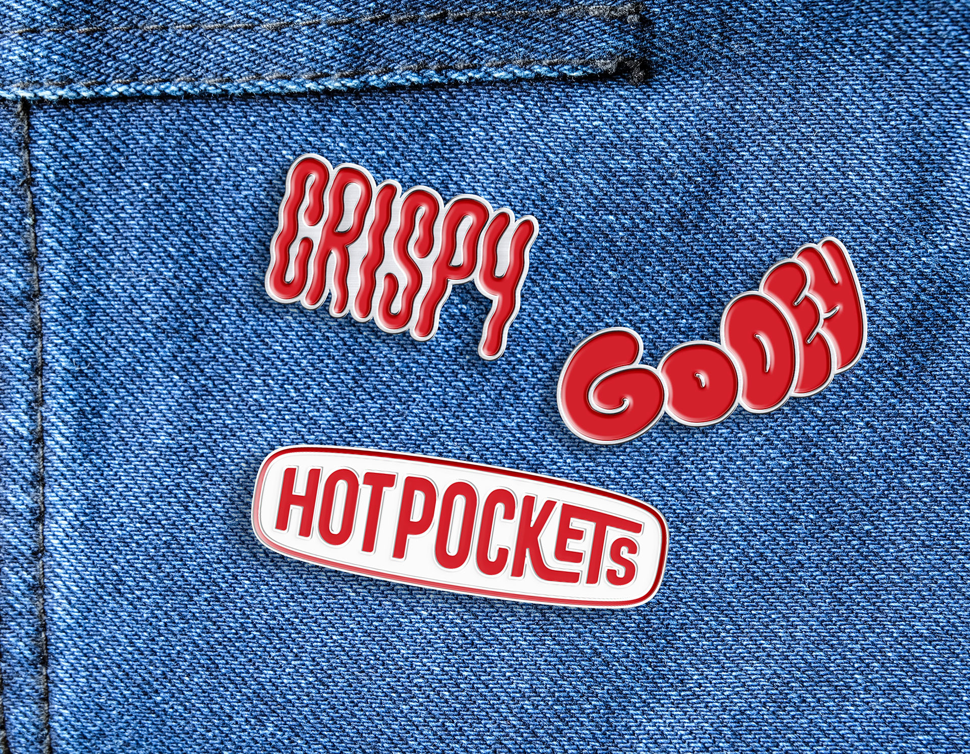
We created a large library of hand-made type lockups, icons, illustrations, and brand patterns to keep things looking hot and delicious across a variety of media and applications.
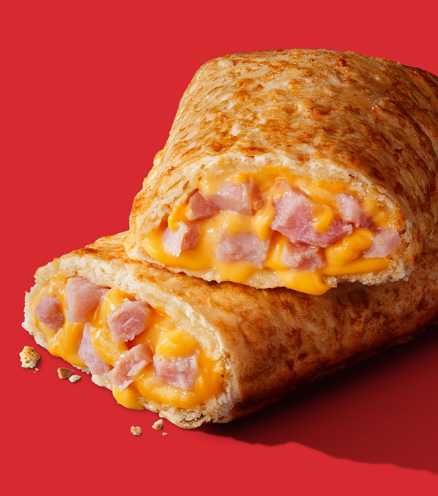
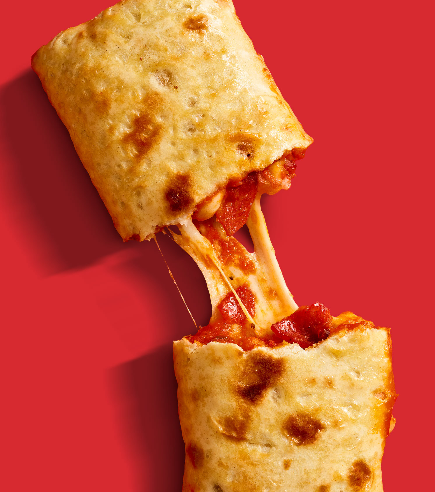
Big changes mean big taste.
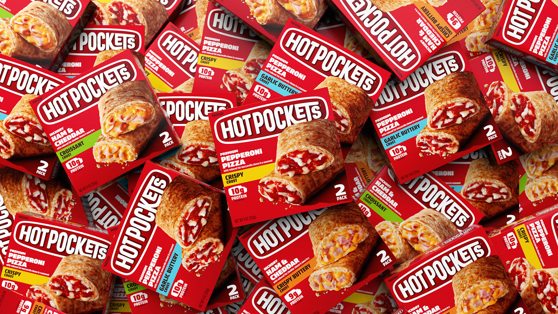
This rebranded design system was the biggest visual departure for Hot Pockets in decades, revitalizing the beloved brand and proudly ushering its piping hot goodies into the future.
The outcome? Effective.
In the six months following the launch of the new design, Hot Pockets’ sales increased by 39% compared to the same period during the prior year.