
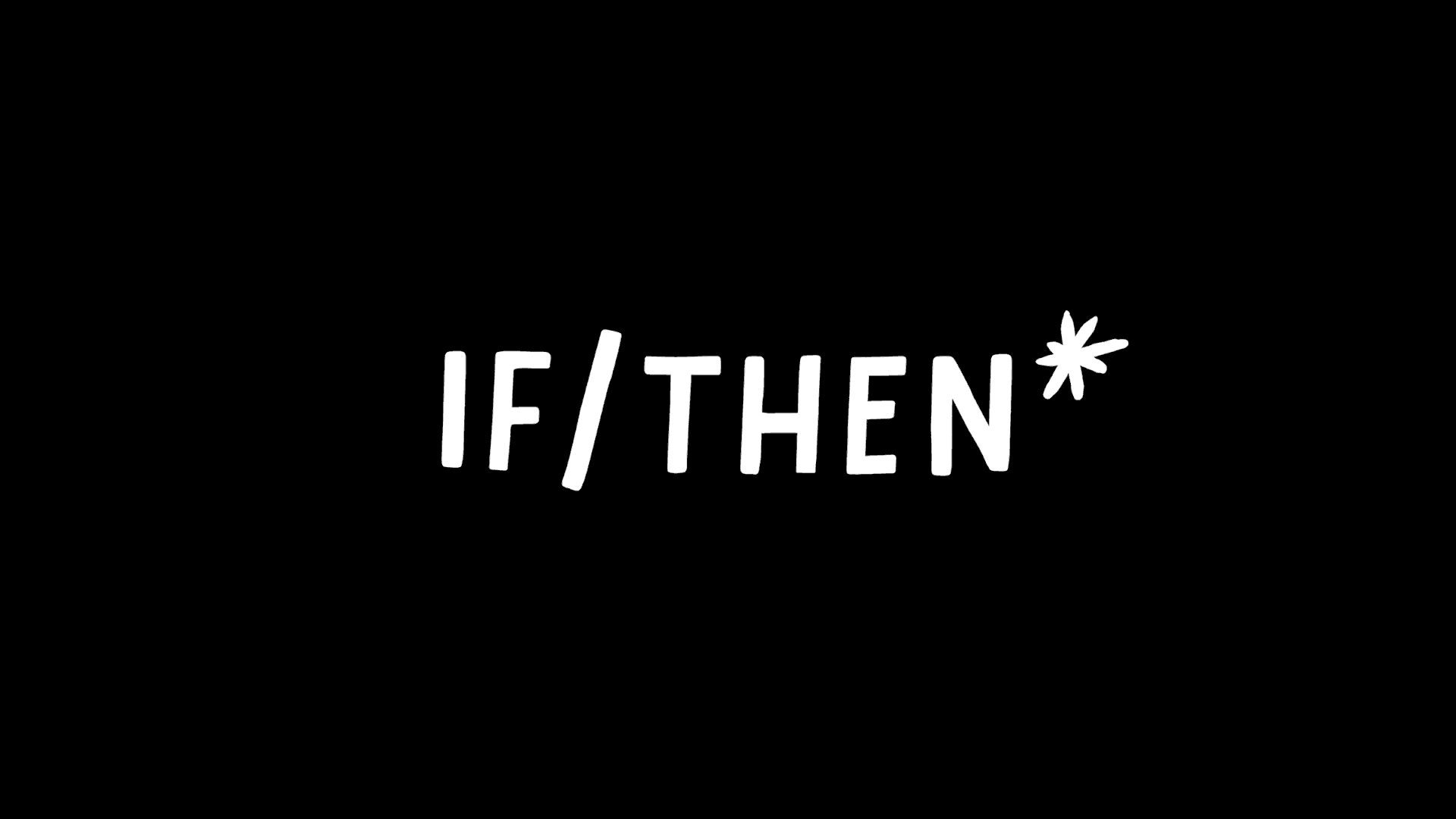
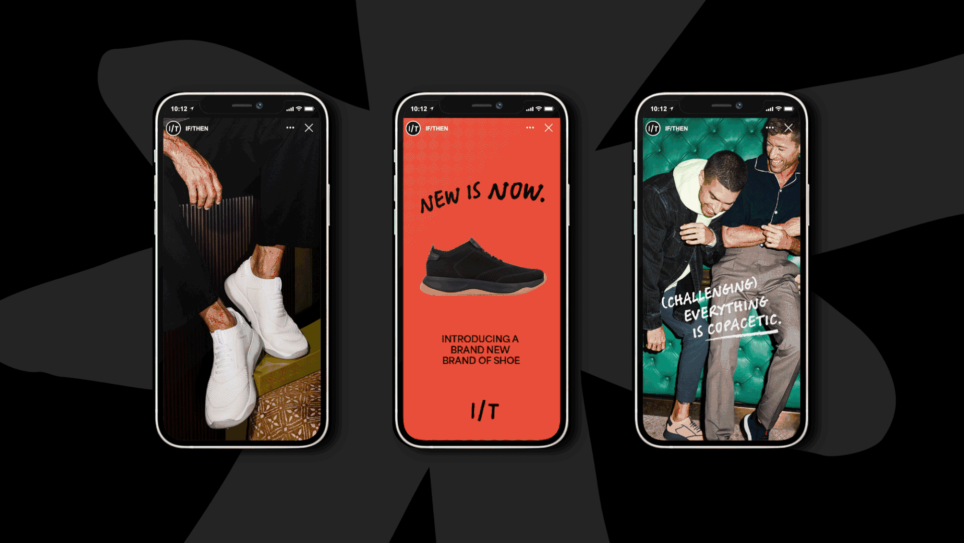
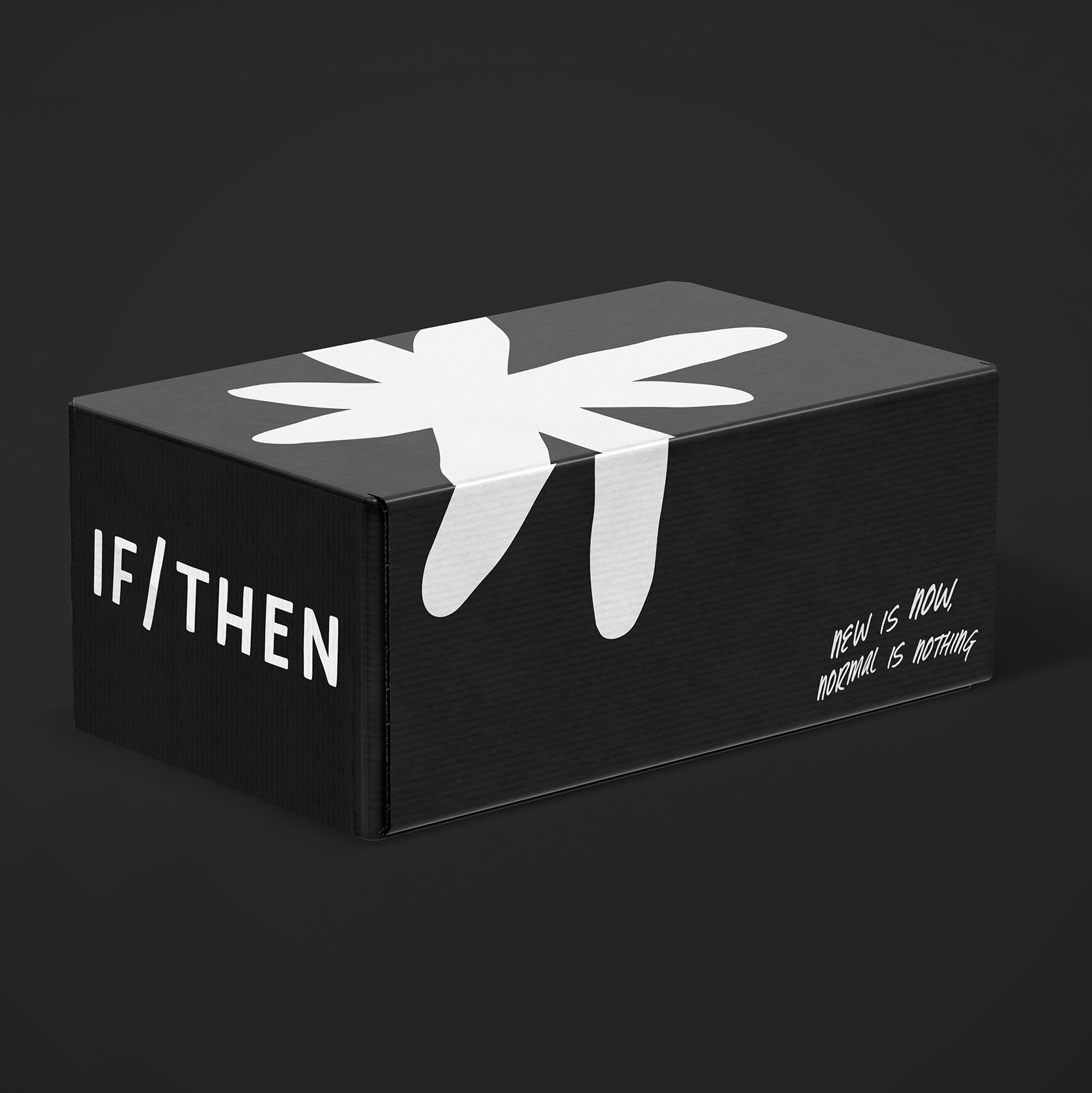
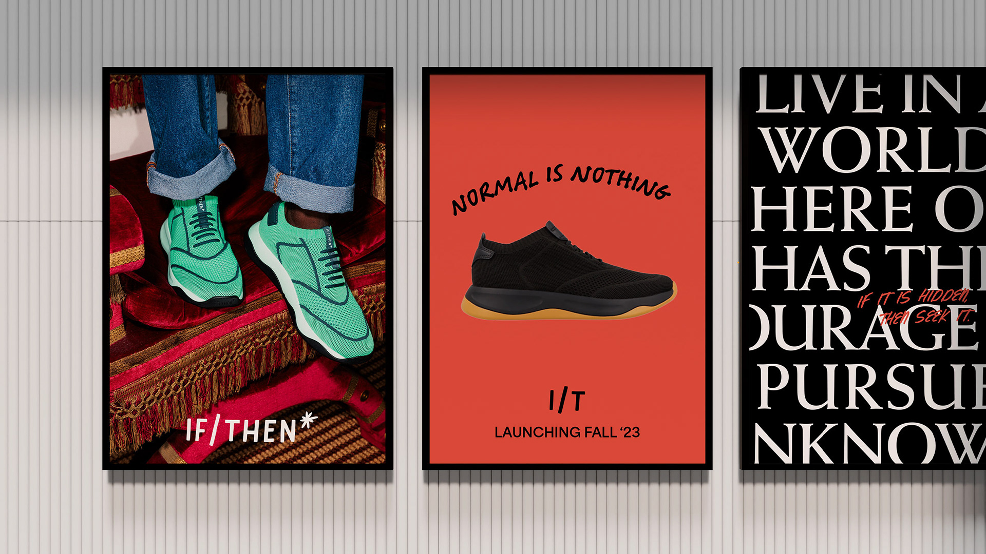
IF/THEN
A brand new brand of shoe.

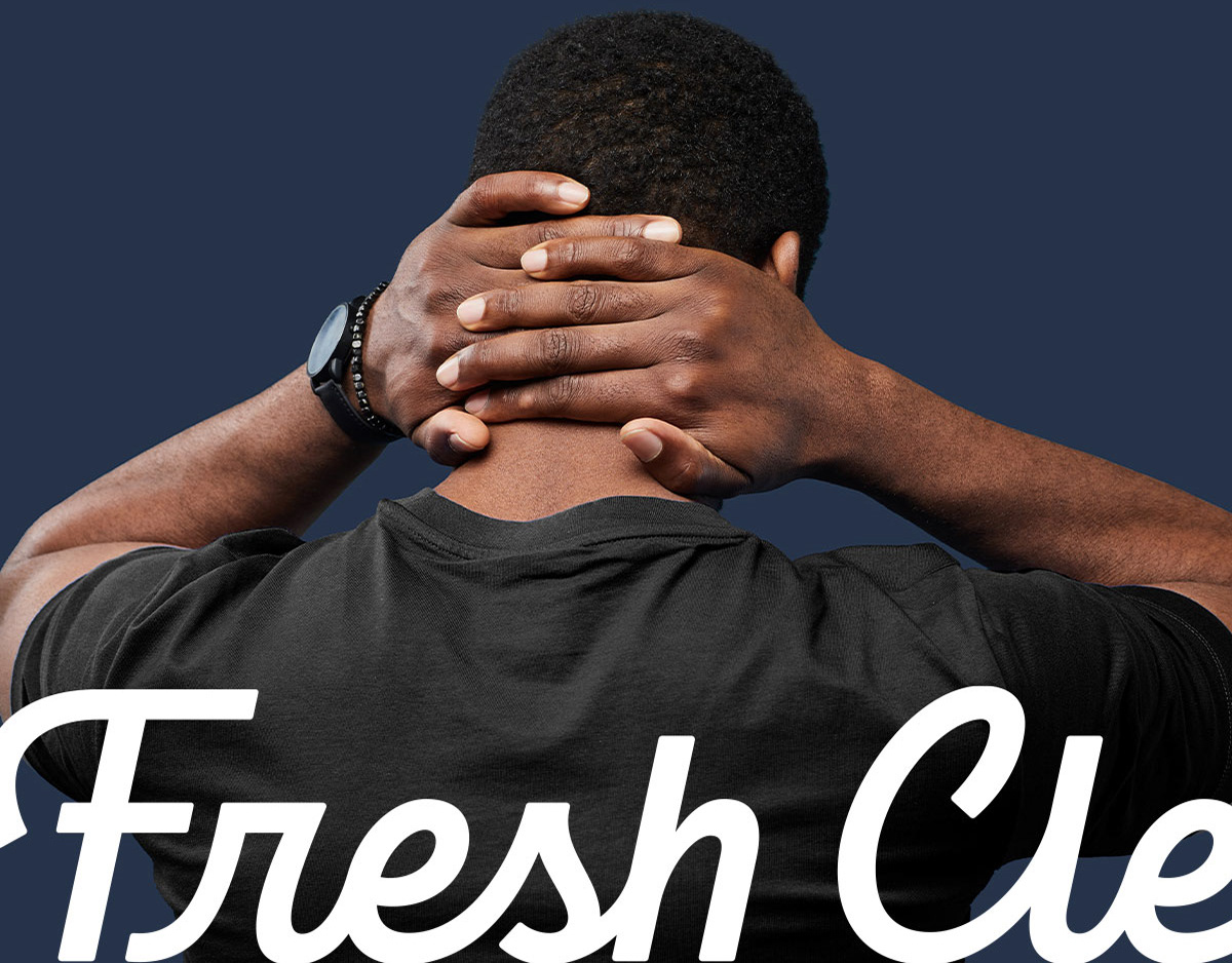
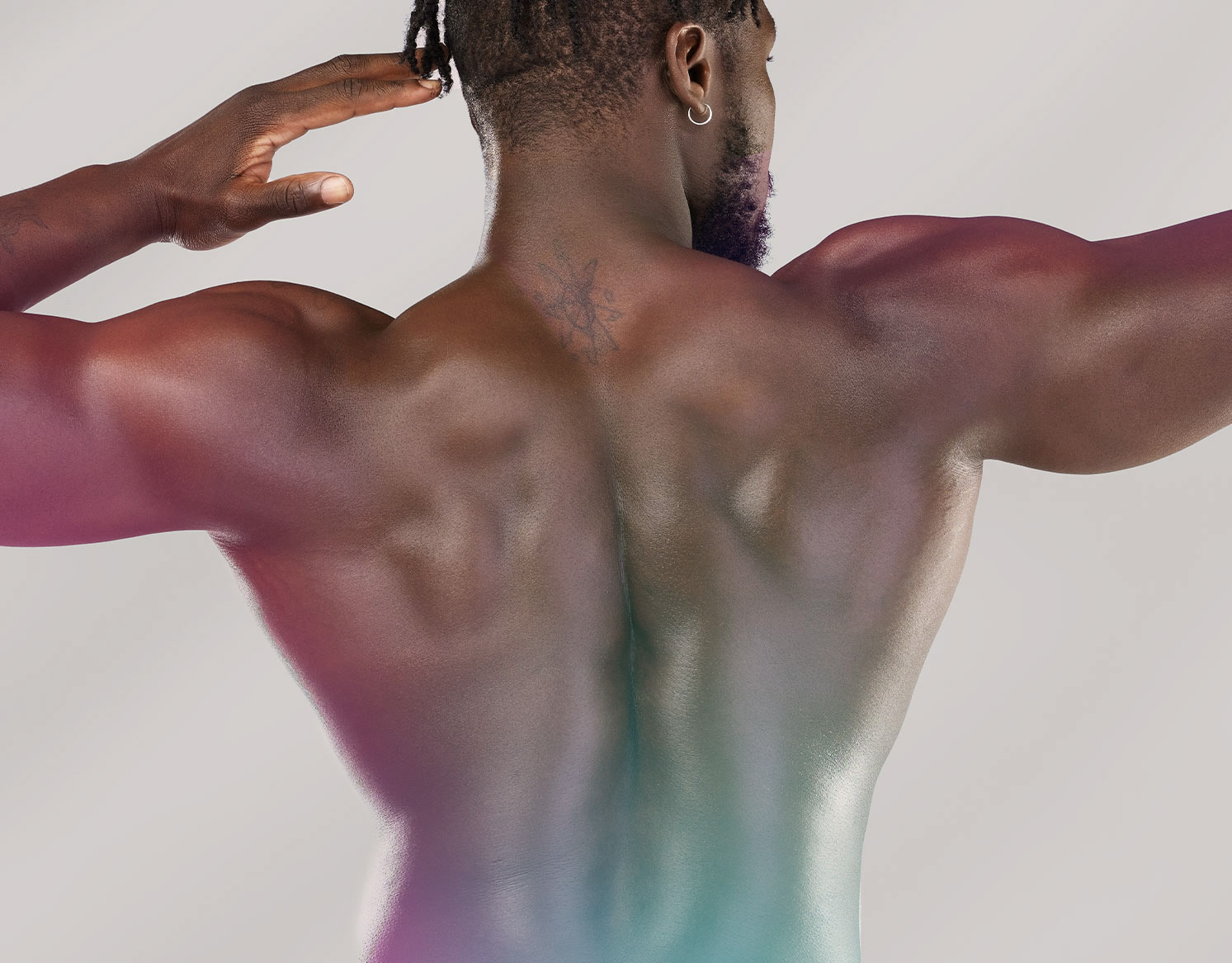
Crafting a shoe brand, one step at a time.
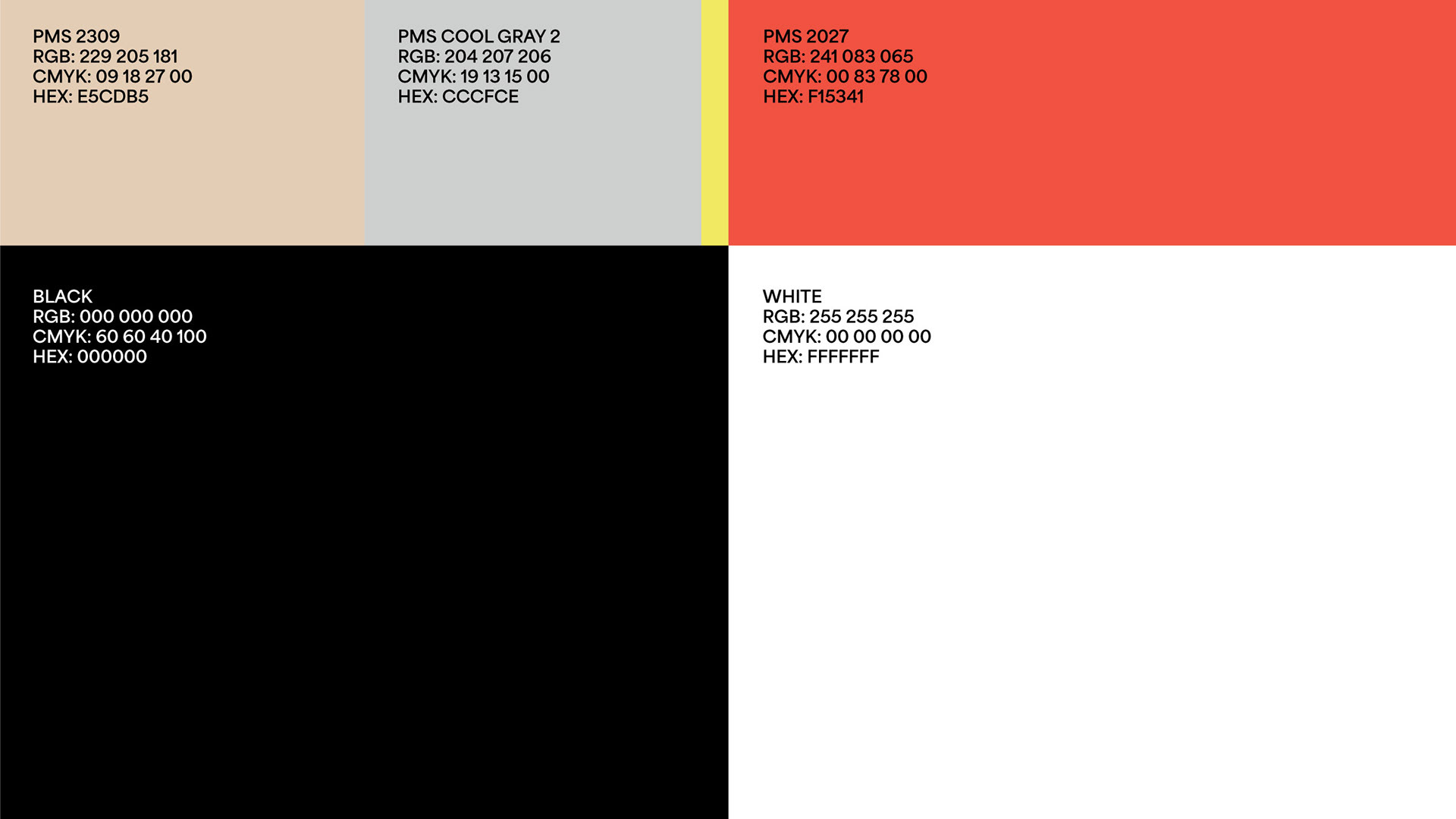
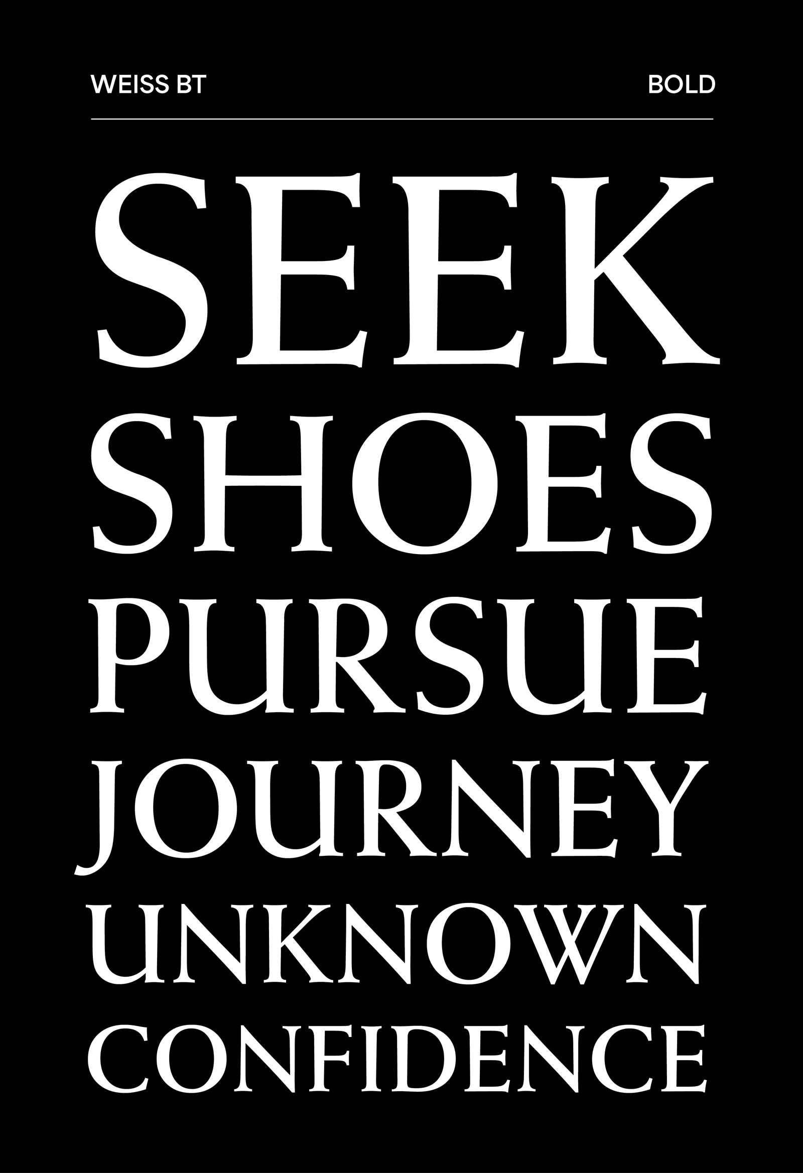
When Interact was approached to brand a new kind of shoe, we were given a completely blank slate. We developed the name, tone of voice, photography style, shoebox, and helped build a digital presence. Hell, we even influenced the design of the shoes themselves. Not every day you get to do that.


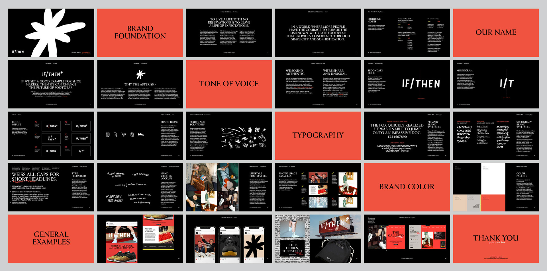
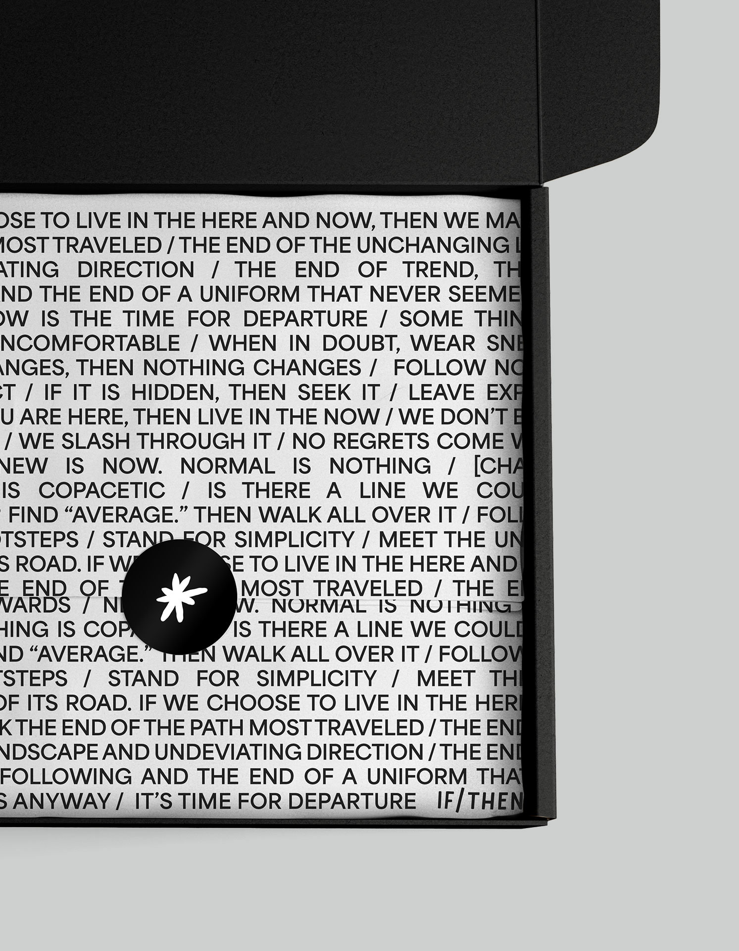
Why the asterisk?
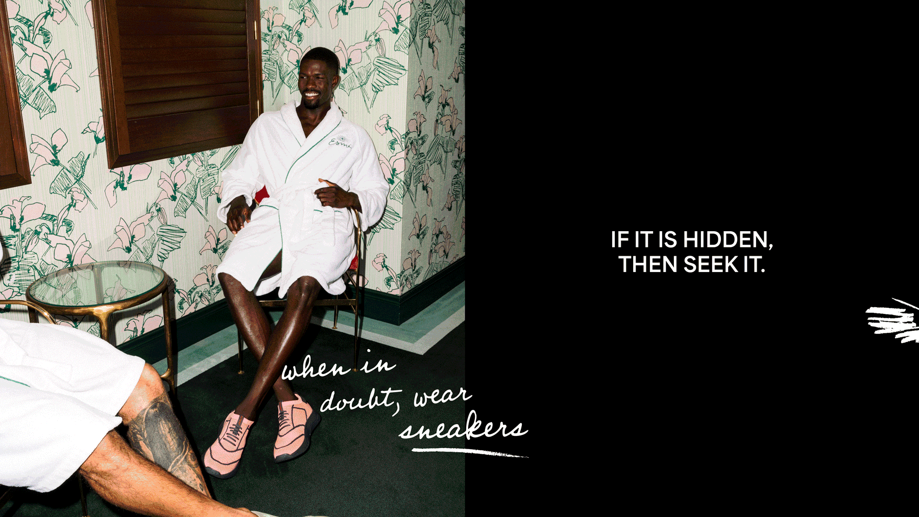
The asterisk represents the authentic, raw, and candid moments of life. It's that moment of pause, of jotting that great idea on the back of a napkin. It's that additional context and level of nuance that might not be present on the surface. The asterisk is a symbol that shows that IF/THEN are shoes that are more than they seem.

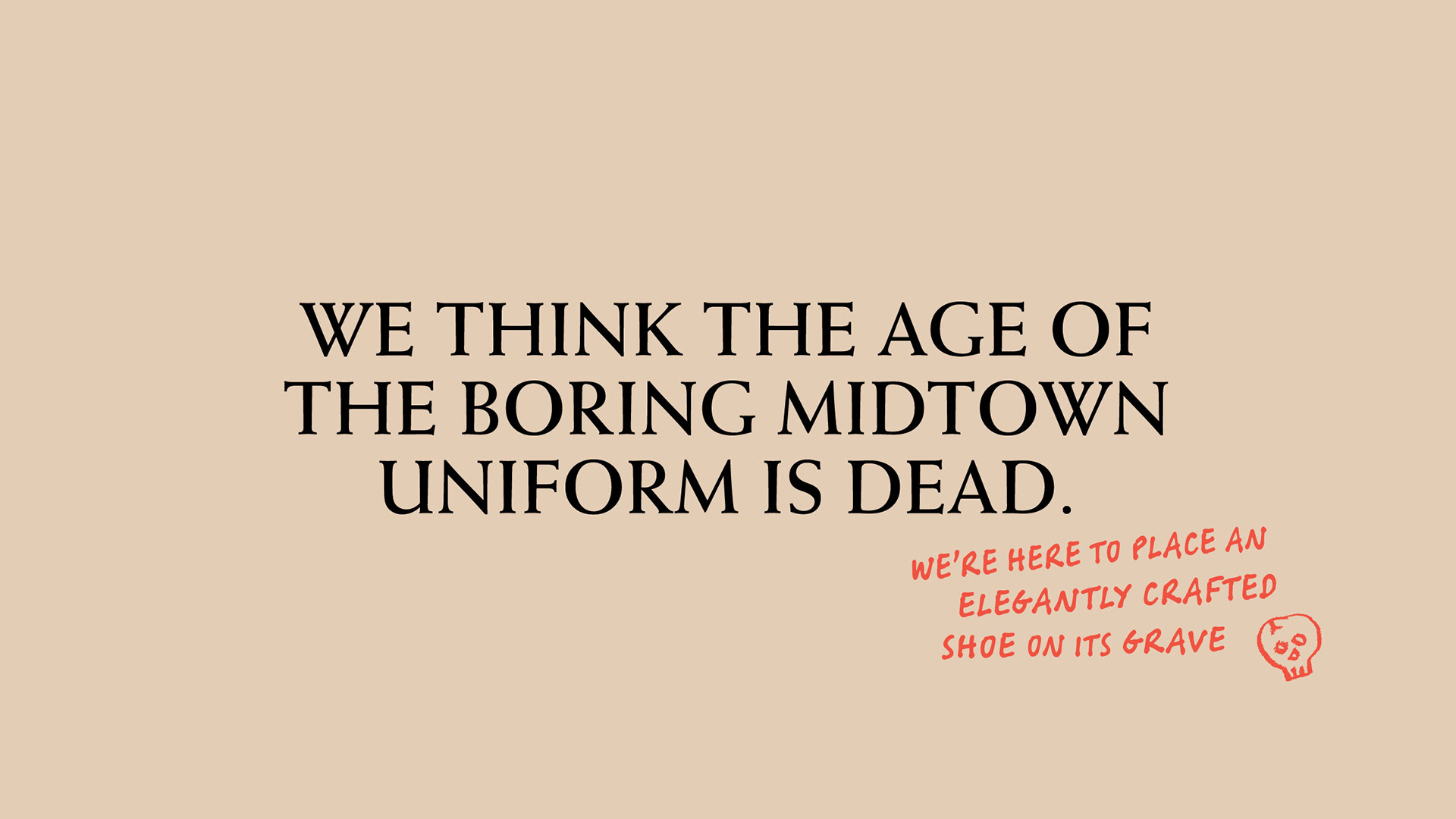

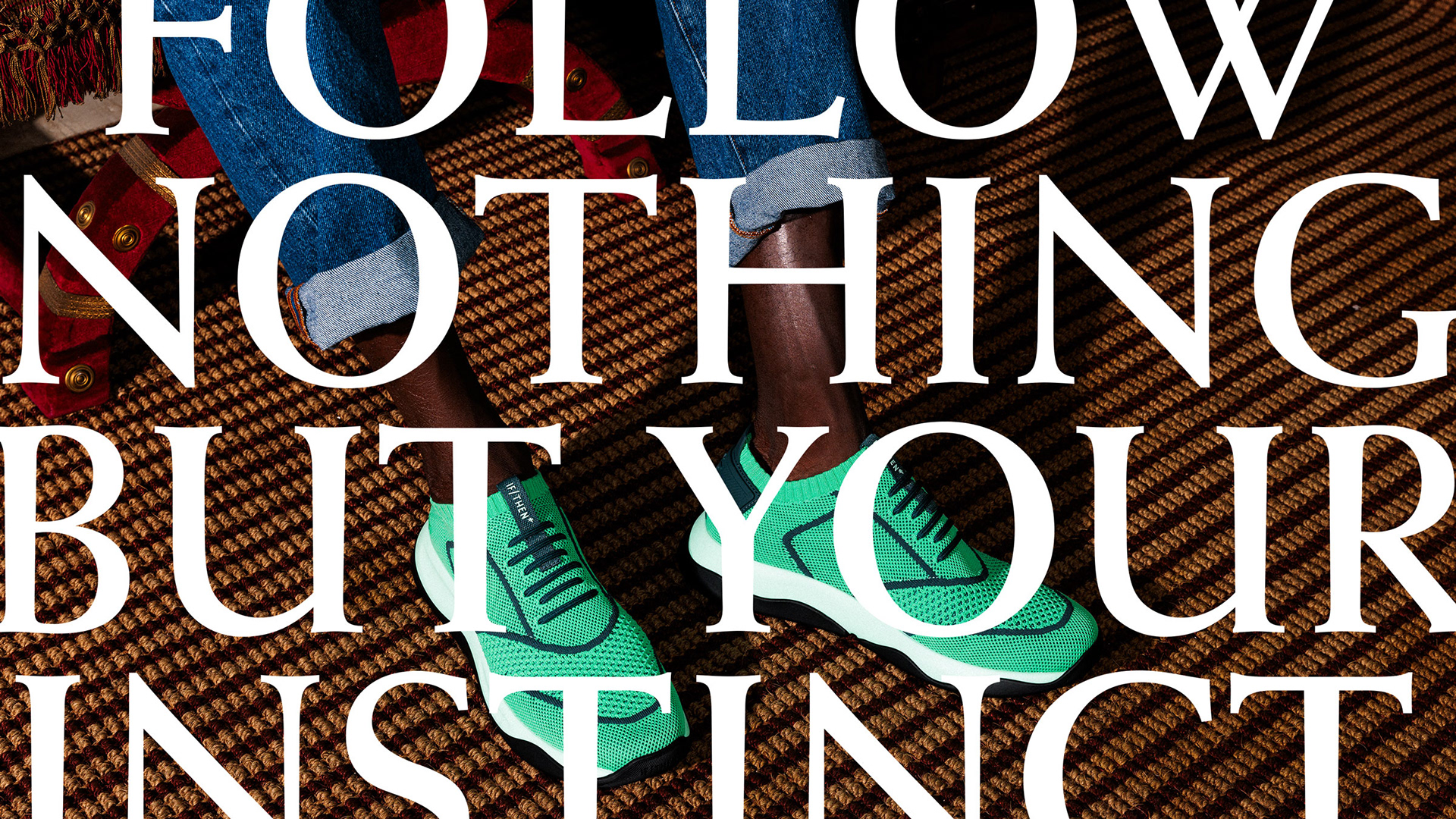
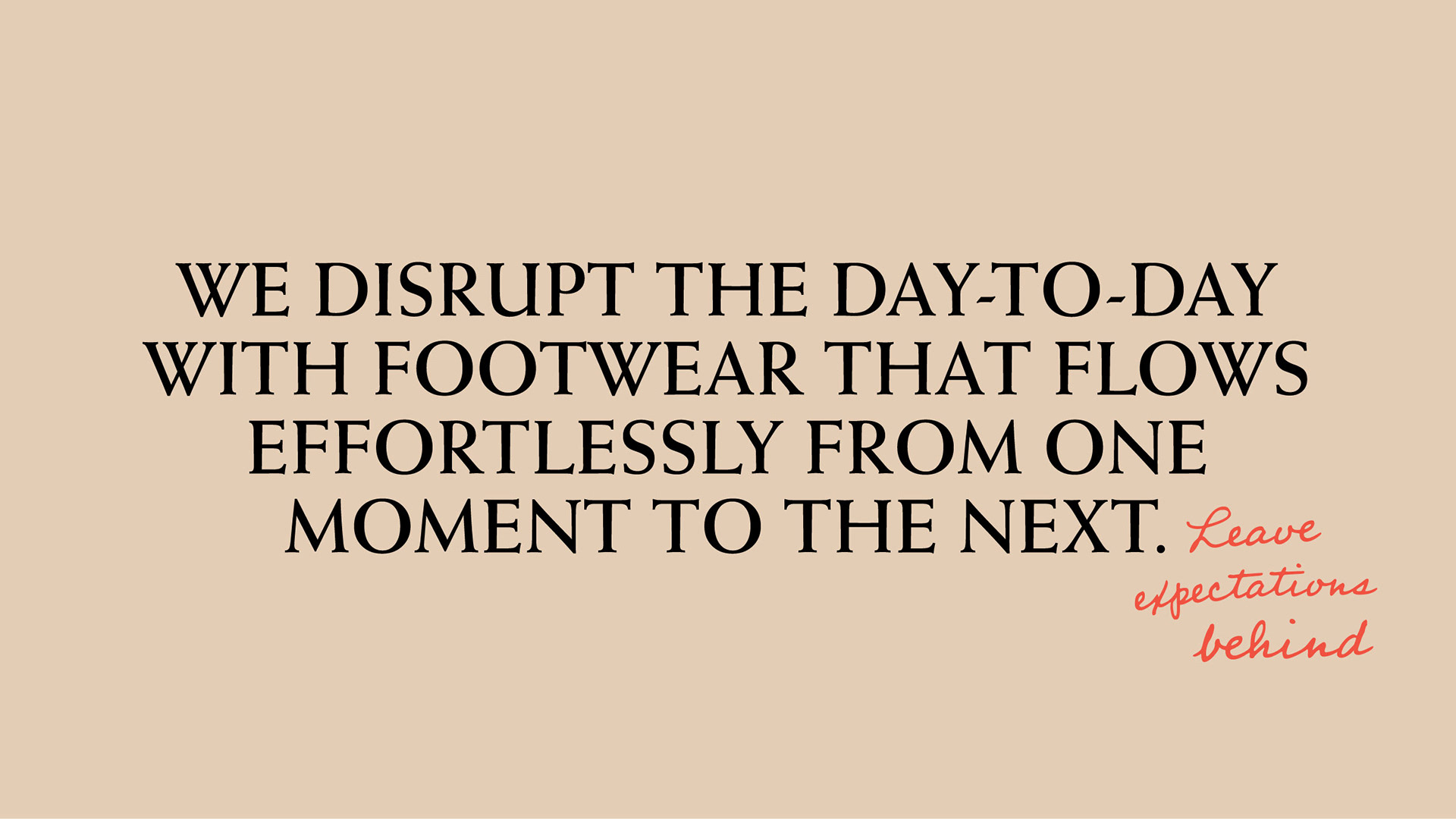


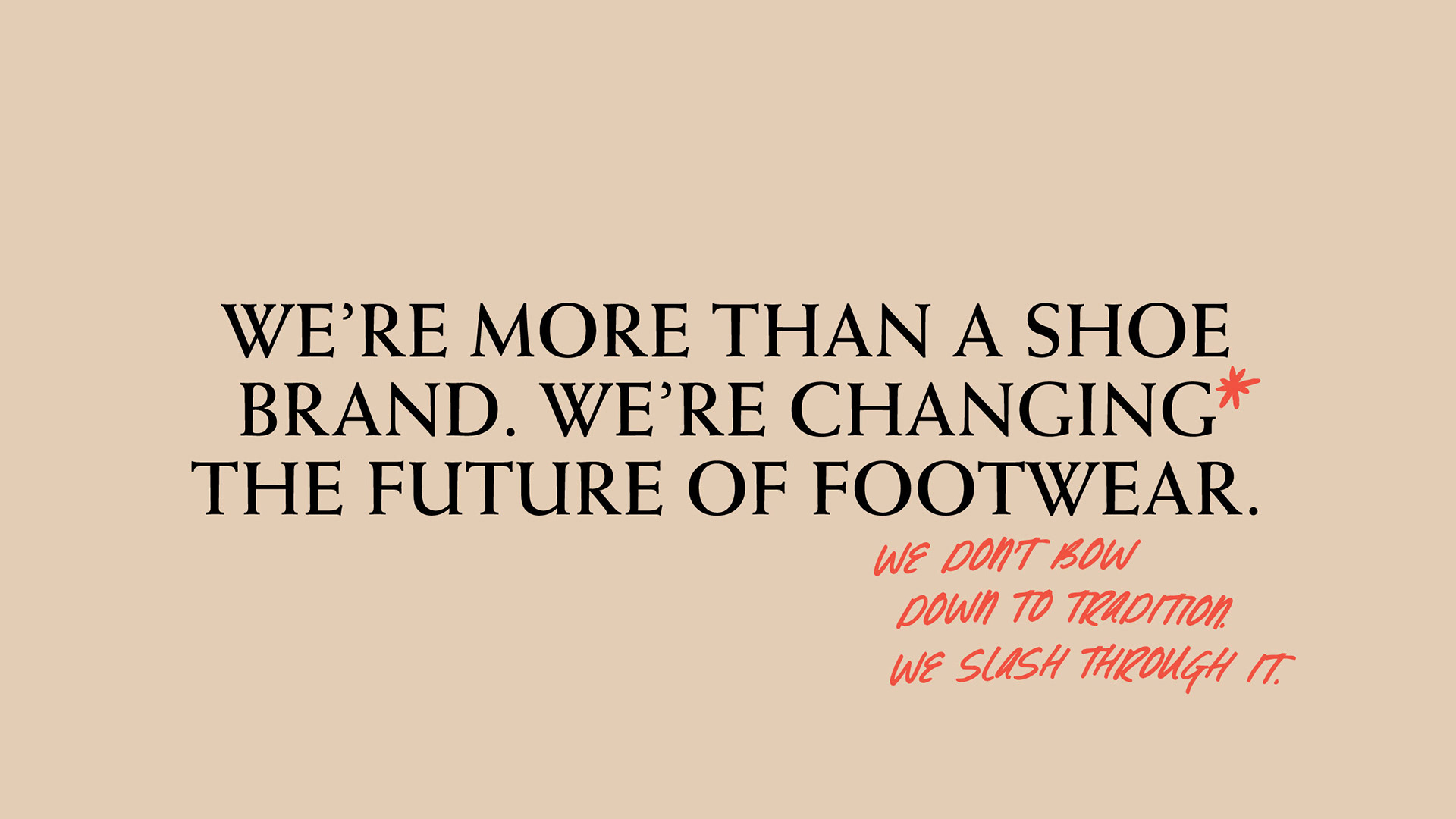

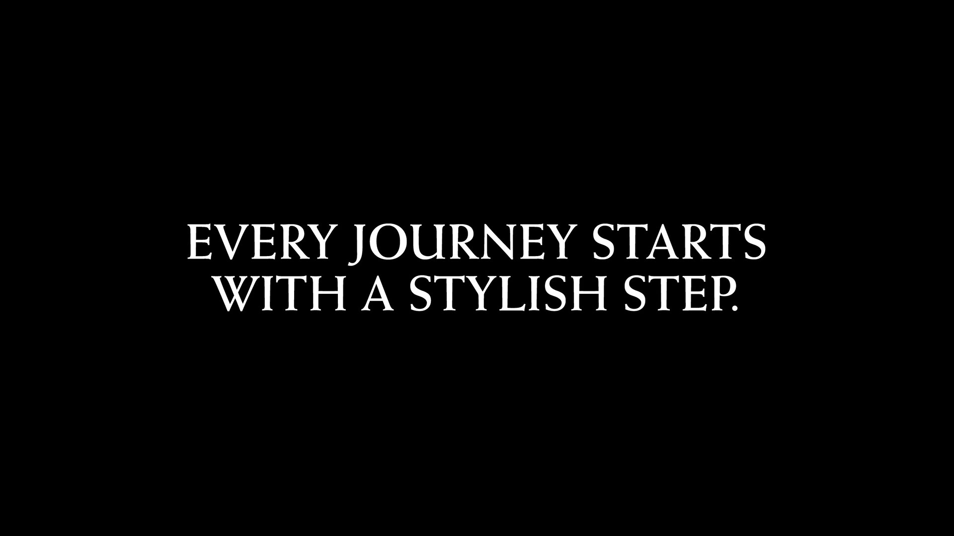
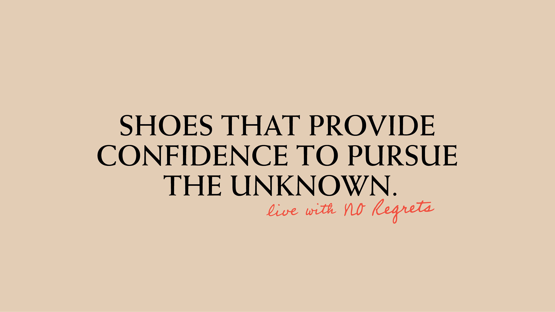
Courage, Comfort. Confidence.
IF/THEN stands for the courage, comfort and confidence you need to pursue the unknown. It’s about slashing through an industry that leaves us wanting at every step; an anthem for living in the moment and being true to yourself. This meant that the brand tone of voice needed to be authentic, honest, and unconventional.